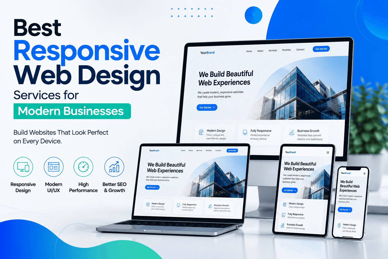
In today’s digital world, a website is often the first point of contact between a business and its customers. Since people access websites from smartphones, tablets, laptops, and desktop computers, businesses need websites that provide a smooth experience on every screen size. This is where responsive web design services play an important role.
A responsive website automatically adjusts its layout, content, images, navigation, and other elements according to the visitor’s device. This makes websites easier to use while helping businesses create a consistent digital experience across different platforms.
Modern responsive web design is not only about making a website mobile-friendly. It also involves user experience, visual design, website performance, accessibility, SEO, and technical development. The right web design approach can help businesses attract visitors, build trust, generate leads, and support long-term online growth.
What Are Responsive Web Design Services?
Responsive web design services focus on developing websites that work effectively across multiple devices and screen sizes. Instead of creating separate websites for desktop and mobile users, responsive design uses flexible layouts and development techniques that allow a single website to adapt to different screens.
Professional responsive web design can include:
Mobile-friendly website design
Flexible page layouts
Custom UI/UX design
Responsive navigation
Fast-loading website structures
E-commerce website development
Landing page design
Website redesign
Cross-browser compatibility
SEO-friendly website structures
Performance optimization
A well-designed responsive website makes it easier for visitors to find information, interact with content, and take important actions such as submitting a form, making a purchase, or contacting a business.
Why Businesses Need Responsive Websites
With users accessing websites from a wide range of devices, businesses cannot afford to provide a poor mobile experience. A website that looks excellent on a desktop but becomes difficult to navigate on a smartphone can result in lost visitors and potential customers.
Responsive design helps businesses maintain a consistent brand experience while making websites easier to access.
Better User Experience
Visitors expect websites to be simple and convenient to use. Responsive layouts ensure that text, buttons, images, menus, and other elements remain usable regardless of screen size.
Improved Mobile Experience
Mobile users need websites that load quickly and provide easy navigation. Responsive development helps businesses create layouts specifically designed to work effectively on smaller screens.
Stronger SEO Foundation
Search engines consider mobile usability and overall website experience when evaluating websites. A responsive website provides a strong technical foundation for an SEO strategy by allowing businesses to manage one website instead of maintaining separate desktop and mobile versions.
Increased Conversion Opportunities
A confusing website can prevent visitors from completing important actions. Responsive design makes calls-to-action, contact forms, product pages, and other conversion elements easier to access.
What Makes a Good Responsive Web Design Company?
Choosing a responsive web design company involves more than looking at visual designs. Businesses should consider whether the development team understands their goals, audience, industry, and technical requirements.
A reliable web design partner should combine:
Creative design skills
UI/UX expertise
Front-end development knowledge
Mobile-first thinking
SEO awareness
Website performance optimization
Clear communication
Quality assurance
Ongoing technical support
The best results usually come from a process that connects business strategy with design and development rather than treating website design as a purely visual task.
Creatd.it – Responsive Web Design and Digital Solutions
Creatd.it helps businesses build modern digital experiences designed around their specific goals. Our approach combines design, development, user experience, and digital strategy to create websites that are practical, engaging, and ready for different devices.
We understand that every business has different requirements. An eCommerce store may need responsive product pages and a smooth checkout experience, while a service-based company may need a professional website focused on generating leads. Similarly, startups may require landing pages that clearly communicate their products and services.
Our responsive web design approach focuses on creating websites that work effectively across:
Custom Website Design
We create website experiences based on the individual needs of each project rather than relying on a one-size-fits-all approach. The process can include planning, wireframing, visual design, development, testing, and optimization.
UI/UX Design
A responsive website should not only look good; it should also be easy to use. Our UI/UX approach focuses on intuitive navigation, clear content structure, accessible interfaces, and user-friendly interactions.
Responsive E-commerce Websites
Online stores need responsive designs because customers may browse products and complete purchases from different devices. A responsive eCommerce experience can help businesses provide easier product discovery, navigation, and checkout.
Landing Page Design
Landing pages are often created with a specific marketing objective, such as generating leads, promoting a service, or encouraging visitors to take an action. Responsive landing page design ensures that these pages remain effective across mobile and desktop devices.
Website Redesign
Older websites may suffer from outdated designs, poor mobile experiences, slow performance, or confusing navigation. A responsive redesign can modernize the website while improving usability and supporting current business goals.
Our Responsive Web Design Process
Creating an effective website requires more than immediately starting development. A structured process helps ensure that the final website meets both user and business requirements.
1. Research and Planning
We begin by understanding the business, target audience, competitors, website objectives, and required functionality.
2. Wireframing and UX
The website structure and user journey are planned before the visual design is finalized. This helps create a clear and logical experience.
3. UI Design
Visual elements such as typography, layouts, buttons, colors, images, and other interface components are developed to create a consistent brand experience.
4. Responsive Development
The approved design is converted into a functional website that adapts to different screen sizes and devices.
5. Testing and Quality Assurance
The website is tested across different screen sizes, browsers, and devices to identify usability, layout, and performance issues.
6. Launch and Improvements
After launch, websites can be monitored and improved based on user behavior, business requirements, SEO performance, and technical needs.
Responsive Design and SEO: How They Work Together
Responsive design can support a broader SEO strategy by creating a consistent website structure for users and search engines. When important content is available through a single responsive website, businesses can focus their SEO efforts on one primary domain and website structure.
However, responsive design alone does not guarantee higher search rankings. SEO also depends on factors such as content quality, technical optimization, page speed, backlinks, search intent, website authority, and overall user experience.
For this reason, responsive design should be considered an important part of a complete digital marketing strategy rather than a standalone SEO solution.
How Responsive Web Design Can Support Business Growth
A professional website can become more than an online brochure. When its design, content, user experience, and functionality are aligned with business objectives, it can become an important tool for generating leads and supporting customer relationships.
Responsive design can help businesses:
Reach users on more devices
Improve website usability
Create a stronger first impression
Support lead generation
Improve online shopping experiences
Strengthen brand consistency
Make websites easier to maintain
Build a better foundation for digital marketing
Choose a Responsive Web Design Approach Built Around Your Goals
Every business has different customers, products, services, and objectives. Therefore, the ideal website should be designed around those specific requirements.
Whether you need a business website, eCommerce platform, landing page, portfolio website, or complete website redesign, responsive design can help create a more accessible and user-friendly digital experience.
With the right combination of responsive web design, UI/UX, development, SEO, and digital strategy, businesses can create websites that not only look professional but also contribute to measurable online growth.
Conclusion
Responsive web design has become an essential part of modern website development. Businesses need digital experiences that work smoothly across smartphones, tablets, laptops, and desktops while remaining easy to navigate and visually consistent.
A successful responsive website combines thoughtful design, reliable development, user experience, performance, and business strategy. By investing in a professional responsive web design solution, businesses can create a stronger online presence, improve customer experiences, and build a solid foundation for future digital growth.
Creatd.it provides digital solutions designed around modern business needs, helping organizations turn their ideas into professional and user-focused digital experiences.
 7 min read